When creating landing pages for your affiliate campaigns, it’s not always just about your call to action or the offer being promoted. Of course these are two of the most important things to focus on, but it’s actually not the determining factor in whether you find success or not. Instead, it’s more about looking at your landing page as a whole and breaking down each of the key contributors on how to increase your conversions — such as landing page design, speed, ad copy and colors.
For instance, the colors being used on your landing page are extremely important, as different colors bring out different emotions. This is exactly what we are going to be talking about in this article — how you can trigger different emotions based on the colors you use, how to perform simple color change split tests and increasing conversions in the process.
The Emotion of Colors
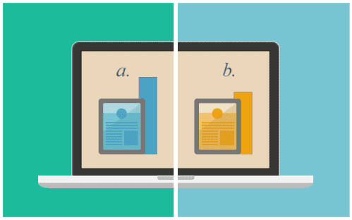
Landing pages shouldn’t be created just based on them looking good. Instead, take a different approach and understand what each color represents and the emotions they might trigger when someone sees them on your page. A great way to break this down is through an infographic that was created by KissMetrics. You can see the color chart below and some notes on what emotion each color represents.
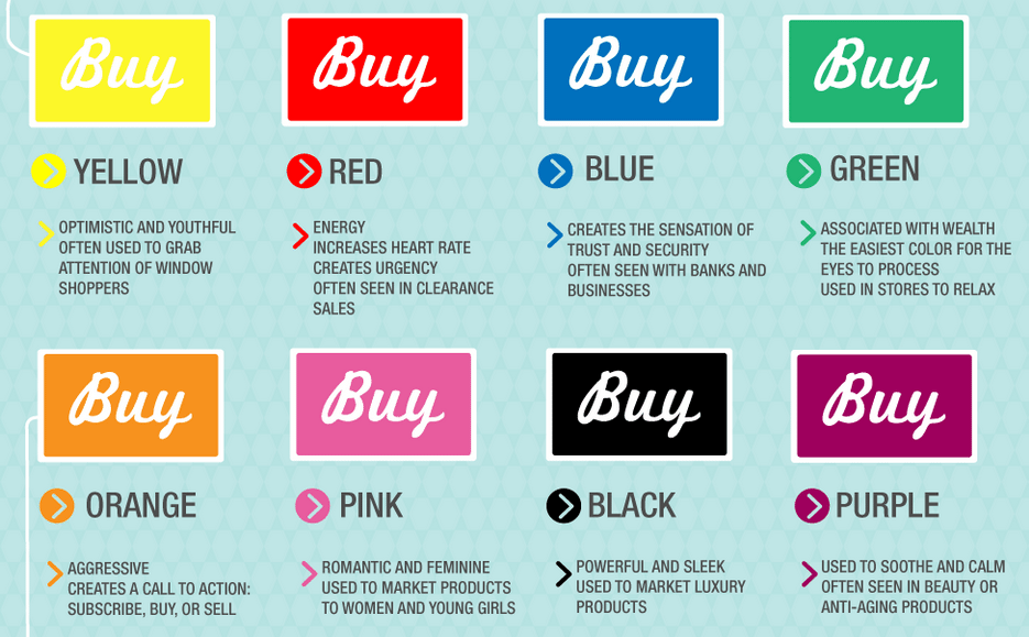
When you look at each of the colors shown above, without even reading the description, you are likely being triggered with a few emotions. Just as the yellow color really pops off the page and brings awareness, it’s also used to “grab the attention of window shoppers” in real stores. Colors like blue and green are often used to gain trust, provide security and be easy on the eyes. Be sure to look through each of the colors and the emotional triggers they have associated with them.
As for how each of these colors are actually used on landing pages and for how they might relate with shoppers, KissMetrics had the following to say.
- Red/Orange, Black and Royal Blue are all used to pull in “Impulse Shoppers” and are often seen at fast food, outlet malls and clearance sales.
- Colors like Navy Blue and Teal are targeted towards “Shoppers on a Budget” and are often seen at banks and larger department stores.
- Pink, Sky Blue and Rose are colors associated with “Traditional Buyers” and are commonly used in clothing stores, especially those with a female demographic audience.
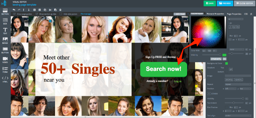
Here’s a great example of BLUE and BLACK being used on a landing pages to “market a luxury product” and “gain trust” in the process.
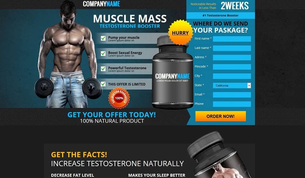
This landing page was created through the AdsBridge platform and also has the ability to split test images, text ad copy and of course colors.
How to Split Test Colors on Your Landing Page
When using different call to actions and buttons on your landing page, it shouldn’t just be the text that you are changing around, but also the colors as well. As shown in the landing page screenshot above, you will want to build a landing page that not only looks good, but also uses the right colors to relate with your target audience. Instead of trying to find that perfect call to action title or image for your landing page, you could see improvements in your conversion with just a simple button color switch.
In this dead simple case study from Shoemoney.com, an green button was swapped out with an orange button and the campaign instantly saw a huge conversion swing.
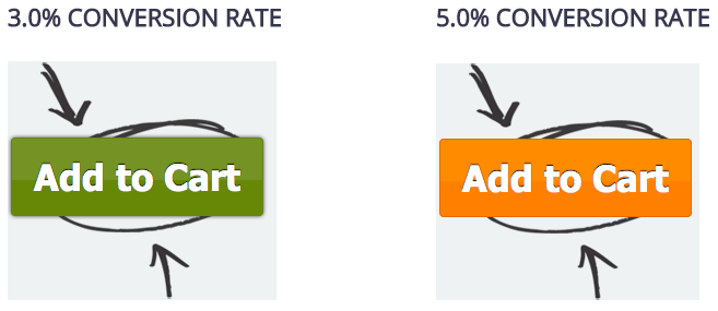
Now you might be saying a 3% to 5% conversion swing isn’t huge… but it actually is!
Think about if you had a landing page that was getting only 1,000 visitors to it per day. With a 3% conversion, you would be getting 30 leads per day. At 5% you would be getting 50. That’s an extra 20 leads per day and more than 600 extra leads per month! Depending on the type of leads or sales you were generating, this small percentage swing could results in six to seven figures in addition revenue per year.
Now the next question is… how might a blue button perform?
To answer this question, the best option would be to start split testing color changes on your landing page. To do this, simply login to AdsBridge and create a landing page with different areas to A/B test (such as a button with different colors to rotate). This is extremely easy to setup and track since AdsBridge not only allows you to create landing pages with a WYSIWYG editor, but also provides you with internal tracking and automatic optimization as well.
Once your split testing is setup and in place, all you need to do is sit back and wait for traffic to hit your site and then view the conversion results within your AdsBridge dashboard.