Here are some form optimization tips for your landing pages:
1. Include A Privacy Line
In general, a privacy line below the form helps with overall conversions. Try something like “we respect your privacy” or “we do not provide information to third parties”. Other variables we’ve tested around the lead form do not increase conversions as much as this one does. Here, it’s the trust factor that tends to increase form conversion rates.
2. Go For Fewer Form Elements
Think of gathering information from a client not as an event but as process. The idea is to ease into a relationship with your prospects — you do not want to startle or put buyers on edge by asking too many questions.
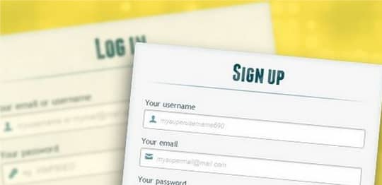
3. Take Up Less Space With Form Fields
Don’t leave a lot of space in between form fields. The game is to have fewer elements on the page and to try to incorporate more elements into a smaller space. Here are a couple ideas:
- Try 2 elements per line to take up less space. For example, ask for first/last name in one field rather than asking for the information in two separate fields.
- Reduce the amount of space between each form field.
4. Use Optional Form Fields
Use optional fields on your form to decrease the amount of information requested from the get-go from prospects. Prospects are able to provide more information if they’d like but they are not forced to.
One of my favorite “formulas” is the five-field form with 3 required fields and 2 optional ones. Take a look at suggestions below for some ideas:
- Name – required
- Email – required
- Phone number – required
- City – optional
- State – optional
5. Try A Two-Page Lead Form
Another great option is to use a two-page strategy. Again, encompasses the idea of not moving too fast.
A good analogy to think of here is dating. If you ask your date 100 questions right off the bat, you’re likely to freak out them out and not get a second date. It’s a far more effective to ask questions over a longer period of time (like over a second or third date) than to pounce all over your poor date the second you meet.
Note: Two and even three page forms can convert better than one page ones.
6. Use Compelling Words On Submit Buttons
Specific and benefit-oriented wording like “get a free obligation quote now” and “get a quote now” tends to convert better than “click here” or a “submit” buttons.
Weaving benefits into the buttons is also an excellent way to reiterate benefits. You’ll likely have many wording ideas so the key idea is to test different ones.
7. Design Buttons That Convert
The best button colors are orange and blue, as they tend to provide the best conversions. To determine appropriate button size/wording on buttons, step away from your computer and glance at your screen.
If size is appropriate, you should be able to see both buttons and wording on buttons if you’re walking by the computer. Optimizing for a smaller screen is best to ensure both laptop and desktop users can see buttons.
8. Sentence casing is better than phrase casing
9. Don’t ever use CAPTCHA on forms